architecture
Saturday, June 4, 2016
Tuesday, May 24, 2016
Journey through landscape
Journey through landscape
The landscape is designed for riding bicycle .In the first step you face the main entrance
Near the main entrance, there is a place for renting bicycle.So you can start your journey from the main entrance. As our area is not too much big, I extend the paths that makes them experience all the space in order to receive the highest area. During the way after each main path there is bigger area that they can rest or even put their bicycle and continue their journey by walking.
After passing all the way, on the top of topography there is a cafe provided a great view through the whole landscape. Therefore it can be a motivation for rider to receive the highest level of topography.
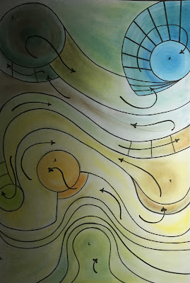
Here also the arrows shows apparently the way they should pass. It is evident they should experience all landscape in order to get the highest level.
space for cowling baby with an ever bouncing ball
space for cowling baby with an ever bouncing ball
This structure will provide an opportunity for both ball and the baby to experience all the spaces through moving all around the space. As we have a continuous path, the ball will move around the space. As a result there is motivation for the baby to go through the whole space. Further more we do not have spoiled space.
This structure will provide an opportunity for both ball and the baby to experience all the spaces through moving all around the space. As we have a continuous path, the ball will move around the space. As a result there is motivation for the baby to go through the whole space. Further more we do not have spoiled space.
Saturday, January 16, 2016
preliminary
All the design is made from a group that have two curves.
I use mesh between these curves two connect these curves.Also try to keep balance between different colors and textures.
I use this group 5 times. Every time i rotate this group and change the direction of it in whole design.Concerned what the exercise is asked, i try to relate all the voids and do not cut the flow of space.
Final
firstly, i made two groups.They name group A and group B.
This combination is group A. that consist of 4 elements.
2 brown elements
1 black element
1 mesh element
I keep balance in the colors.
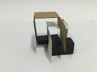
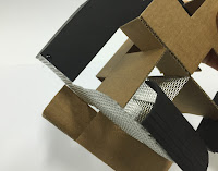
This is group B that consists of 5 elements.This group have two curves. I make a contrast between curves.Not only between their colors but also their direction.
I put a mesh element between curves as a bonding.As it is obvious there is a clear flow of space between these curves.Thus they are in relation with each other.
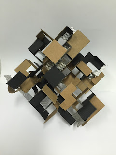
This combination is group A. that consist of 4 elements.
2 brown elements
1 black element
1 mesh element
I keep balance in the colors.


This is group B that consists of 5 elements.This group have two curves. I make a contrast between curves.Not only between their colors but also their direction.
I put a mesh element between curves as a bonding.As it is obvious there is a clear flow of space between these curves.Thus they are in relation with each other.

I put these groups in a way to make rhythm.
A__B__A
B__A__B
A__B__A
In the center of my design i made a hierarchy between the square elements in their place.As you follow the squares in each step they rise.
--
Subscribe to:
Comments (Atom)


